The web spent a decade chasing soft gradients, rounded corners, and friendly pastels. Then the pendulum swung hard the other way. Y2K nostalgia and cyberpunk maximalism collided into one of the most distinctive looks of the decade: neon on black, chrome lettering, glitch artifacts, CRT scanlines, and monospace type. This is the aesthetic our own brand is built on, so we have strong opinions about doing it right, and watching people do it wrong.
Where the look comes from
The revival pulls from two related but distinct sources.
Y2K is the turn-of-the-millennium optimism of 1998 to 2003: chrome gradients, lens flares, bubble shapes, translucent “frutiger aero” surfaces, and a futurism that was shiny and hopeful. Think early iMac translucency and Matrix-era marketing.
Cyberpunk is the darker, dystopian cousin: rain-slicked neon cities, terminal-green text, glitchy CRT decay, and the feeling of a high-tech world gone slightly feral. Blade Runner, Ghost in the Shell, and a thousand synthwave album covers.
Mash them together and you get the current trend: retro-futurism with an edge. Optimistic chrome meets dystopian neon. It signals “tech-forward, irreverent, not corporate,” which is exactly why startups, music sites, and creative studios keep reaching for it.
The core visual ingredients
Neon and high-saturation color
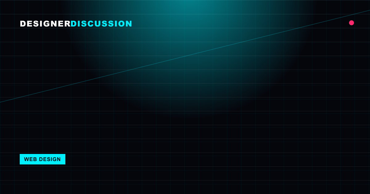
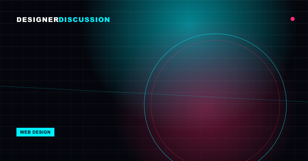
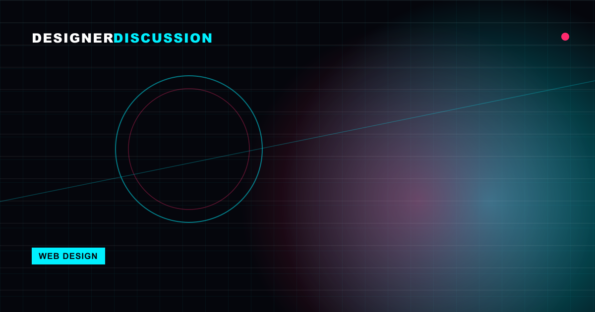
The palette is built on a dark base (near-black, deep purple, midnight blue) with electric accents: cyan, magenta, acid green, hot pink. The accents glow because they sit against darkness. Glow is usually faked with layered text-shadow or box-shadow.
.neon {
  color: #00f0ff;
  text-shadow:
    0 0 4px #00f0ff,
    0 0 12px #00f0ff,
    0 0 24px rgba(0, 240, 255, 0.6);
}
Glitch
Glitch effects simulate digital corruption: RGB channel splitting, jitter, and clipping. The classic technique duplicates an element in cyan and magenta, offsets the copies, and animates them with clip-path. Used sparingly on a headline it is electric. Applied to body text it is a migraine.
Chrome and metallic type
Pure Y2K. Letters rendered with metallic gradients, beveled edges, and reflections. On the web this is a layered linear-gradient text fill, sometimes with a subtle drop shadow to fake the bevel.
Scanlines and CRT artifacts
A faint horizontal-line overlay evokes an old monitor. It is just a repeating gradient laid over the page at low opacity, ideally behind content rather than on top of text.
Monospace and pixel type
Monospace fonts read as “terminal,” “code,” and “machine.” They anchor the whole aesthetic. Pair a mono display face for headers with a more readable typeface for long-form body copy.
How to use it without wrecking readability
This is where most attempts fall apart. The aesthetic is loud by nature, and loud is the enemy of reading. The fix is discipline: pick a few effects, apply them to a few elements, and keep the reading surface calm.
- Reserve effects for accents. Neon glow, glitch, and chrome belong on headlines, logos, buttons, and hero moments. Body text should be clean, high-contrast, and effect-free.
- Mind contrast, always. Glowing cyan on black can look great and still fail accessibility for body sizes. Run real contrast checks. Neon on dark passes more often than you fear, but never assume.
- Give text a quiet backing. When copy must sit over a busy neon-grid background, put a semi-opaque dark panel behind it so the words win.
- Respect motion preferences. Glitch and flicker animations should be wrapped so they pause for users who opt out:
@media (prefers-reduced-motion: reduce) {
  .glitch, .flicker { animation: none; }
}- Limit flicker. Rapid flashing is not just annoying, it is a genuine seizure risk. Keep flashes below three per second and avoid full-screen strobing entirely.
The cyberpunk look works because it is restrained chaos. The neon means something only when most of the page is dark and quiet around it. Turn everything up to eleven and you have just made noise.
Keeping it fast
Heavy aesthetics tempt heavy implementations, and that is the second failure mode. The trend can absolutely be built to load fast.
- Use CSS, not images, for effects. Glow, scanlines, gradients, and glitch can all be pure CSS. A video-background neon city looks incredible and ships a 20MB liability. Prefer a CSS gradient or a heavily optimized still.
- Watch animation cost. Animate
transformandopacity, which the GPU handles cheaply. Avoid animatingbox-shadow,filter, or layout properties on a loop, which can pin the CPU. - Subset your fonts. Display and pixel fonts can be large. Subset to the characters you actually use and self-host with
font-display: swap. - Cap the layered shadows. Each
text-shadowandbox-shadowlayer costs paint time. Three glow layers look as good as eight and repaint far faster.
The goal is an experience that feels expensive and runs cheap.
Real examples worth studying
The Cyberpunk 2077 marketing sites are the obvious touchstone: glitch transitions, neon-on-black palettes, and aggressive mono type, but with readable content blocks where it counts. Synthwave and vaporwave music portfolios lean into chrome lettering and CRT overlays while keeping track listings legible. Plenty of AI and crypto startups have adopted a cleaner cyberpunk dialect: dark UI, a single electric accent, subtle grid backgrounds, and restrained glow, proving the look scales down to something professional.
The lesson across all of them is that the best executions treat the aesthetic as seasoning, not the whole meal. The structure underneath is still a clean, conventional, usable layout.
When to reach for it (and when not to)
This aesthetic is a strong brand signal. It says creative, technical, irreverent, future-facing. That is perfect for music, gaming, AI tooling, creative studios, and dev-focused products. It is exactly wrong for a healthcare portal, a bank, or a government service, where trust and calm matter more than edge.
Match the mood to the audience. If your users came to feel something, turn it up. If they came to get something done, dial it back to a tasteful accent and let the work speak.
The takeaway
The Y2K and cyberpunk revival blends optimistic chrome with dystopian neon, glitch, scanlines, and mono type into a look that signals technical and irreverent. The whole thing lives or dies on restraint: keep effects on accents, keep body copy clean and high-contrast, respect reduced-motion and flicker safety, and build the effects in CSS so the page stays fast. Treat the aesthetic as restrained chaos, with a dark, quiet foundation that makes the neon mean something, and it becomes a genuine brand weapon rather than a wall of noise.